We tend to think the easiest way to make a product look more expensive is to dress it up: colourful backgrounds, accessories scattered around, eye-catching effects. Yet when you look at the images of luxury brands, you see the opposite. A single product, a calm surface, soft light and plenty of space around it. That simplicity isn't a coincidence; it is a deliberate choice.
Known in fashion as “quiet luxury”, this approach favours whispering quality over shouting a logo. The same logic applies in photography: when a product is shown well enough to speak for itself, there is no need to prop it up with a crowded composition. In fact, excess overshadows the product's value.
There is a psychological explanation too. In a crowded image the eye keeps wandering and never settles on anything. In a simple image the gaze goes straight to the product and stays there. People find things that have been given time and presented with care more valuable; the space around a product is the visual expression of that care.
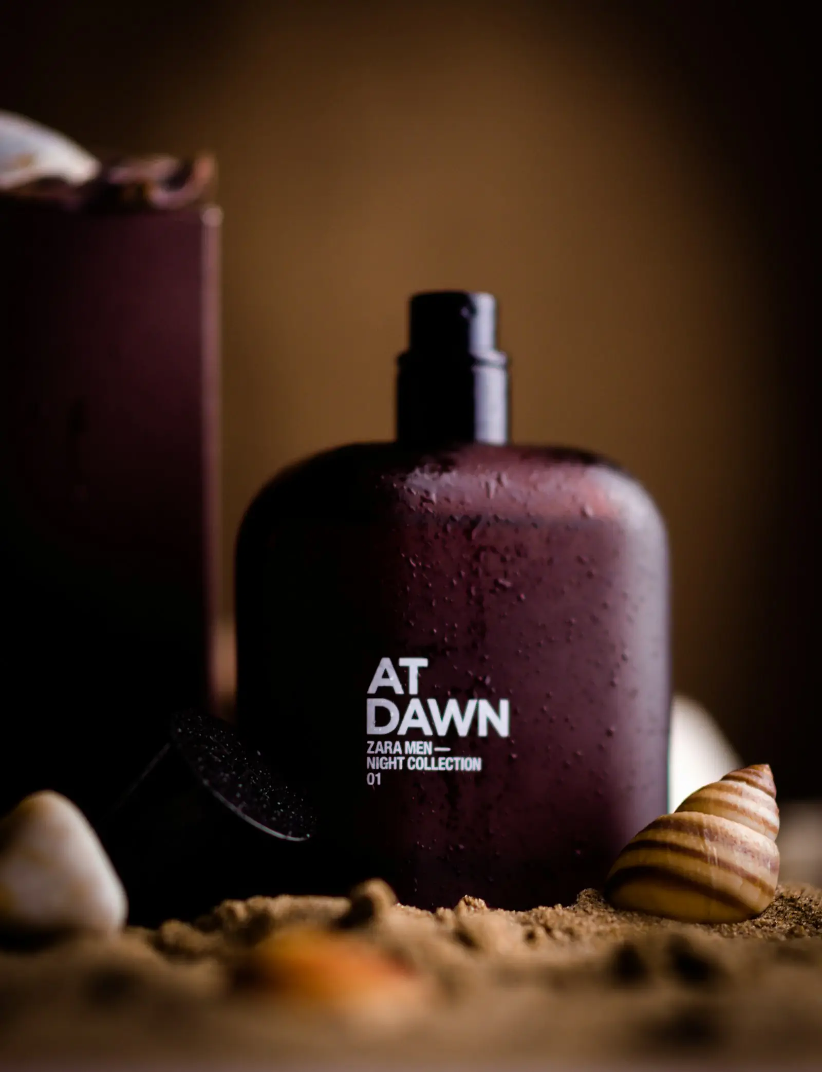

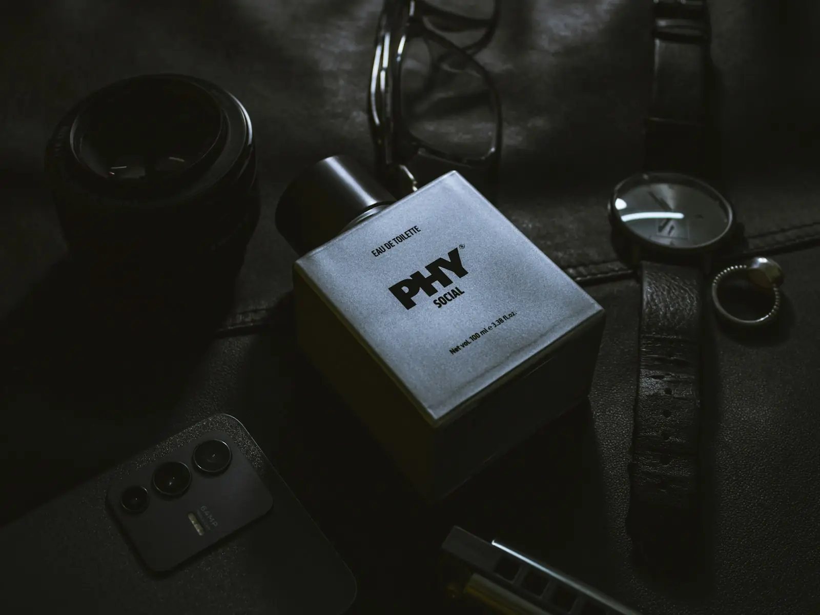
Light is at the heart of this aesthetic. Harsh, scattered light reveals every flaw and makes a product look cheap. Soft light coming from one direction, with controlled shadows, brings out the texture of the material: the weave of a fabric, the shine of glass, the stitching of a leather bag. Dark, simple backgrounds strengthen the effect; the product almost steps out of the darkness towards the viewer.
In composition, empty space matters as much as the product. Leaving the product room to breathe instead of filling every corner of the frame tells the eye where to look. Supporting objects aren't chosen at random either; a few pieces that serve the product's story and belong to the same family of colours and textures are enough.
The colour palette is part of this unity. Quiet luxury usually leans on calm colours such as earth tones, off-whites, deep navy and charcoal grey. These colours don't overpower the product; on the contrary, they bring out its own colour. And when every product in a catalogue is shot on the same palette, the brand gains an identity that can be recognised at a glance.
The nice thing about this approach is that it isn't reserved for big brands. A small boutique, a workshop selling handmade products or a newly founded cosmetics brand can apply the same principles and make their products look far more valuable. What makes the difference here isn't budget but discipline: fewer objects, more attention.
Simplicity has a risk too: done without control, it can look dull and empty. That's why the light, colour tone and texture need to be planned carefully on every shoot, and retouching kept restrained enough to preserve the product's true colour. Quiet luxury isn't carelessness; on the contrary, it is simplicity thought through to the smallest detail.
This aesthetic works not only for websites and catalogues but for social media as well. In a colourful, busy feed, a calm and simple image makes people stop precisely because it is different. And images like these don't date; unlike effects that go out of fashion after a season, a well-lit, simple product photo can be used for years.
Product photos speak for the brand wherever the customer can't touch the product. Crowded, distracting images make a product ordinary, while simple, careful images add value to it. Sometimes the way to look more premium is to show less.
In the Apex Kreatif studio we plan product shoots from this point of view: first the product's character, then the light, and last every detail that enters the frame. If you want your products to look as valuable as they deserve, let's plan your next shoot together.